


May
21
New Wedding Trend for 2020
Comments Off on New Wedding Trend for 2020
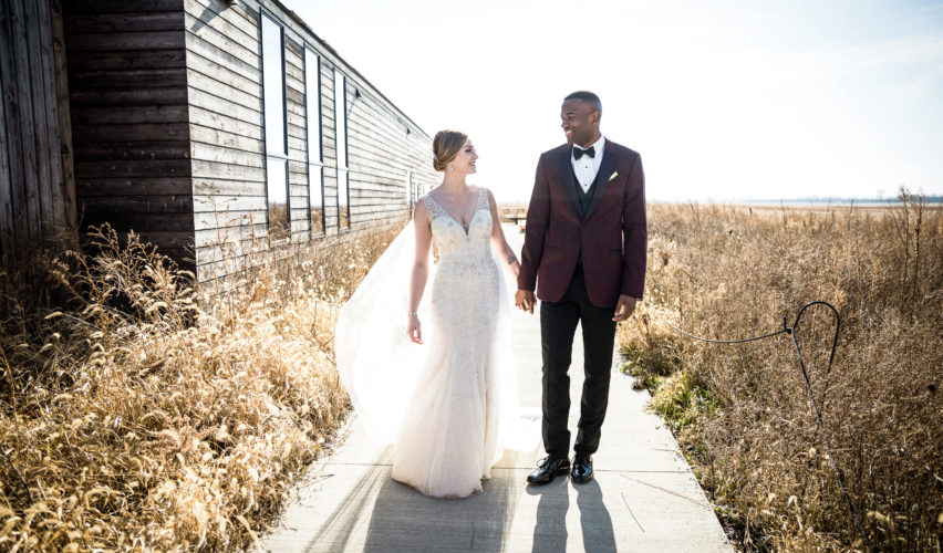
The natural landscapes of the enriched farmlands that surround many of the wedding venues in the Midwest, could all use a brush stroke of color.
At any time of the year, as you are driving along the country roads, you are met with a neutral monochromatic color palette. The colors at the caps of the year are dusty beige, with the time in between, an earnest green. Many weddings designs embrace this color palette, selecting colors of tan, ivory, beige, moss, sage, evergreen. But I say, “let’s add a Crush of Color!”
The West Coast girl in me, has laid down the fear or intimation of using color for weddings. The use of color actually allows the eye to distinguish what you are seeing, in its own entirely. Color is natures highlighter. As a highlighter, it will enhance aspects of your wedding day. Whether in the floral arrangements, frosting on cake, stationery pieces, or on the tabletops. Don’t worry that the use of color will take away from the natural landscape that surrounds your venue, it will only highlight it.
Here are some tips on how to use brush strokes of color.
A neutral color can be: Tan, Ivory, Beige, Grey, Slate, Black, Onyx, White
- Identify your primary neutral color
- Identify your secondary neutral color
- Identify your accent color | use strokes of color but only pick 3 – 4.
- Select where you will place the use of color, as you don’t want to overuse it.
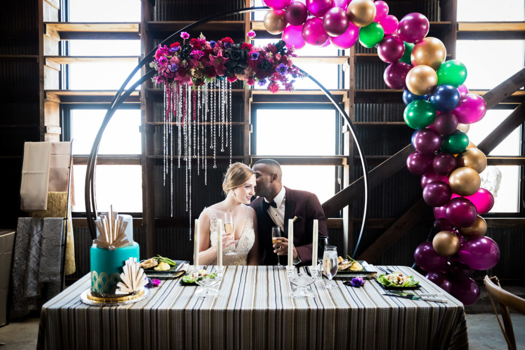
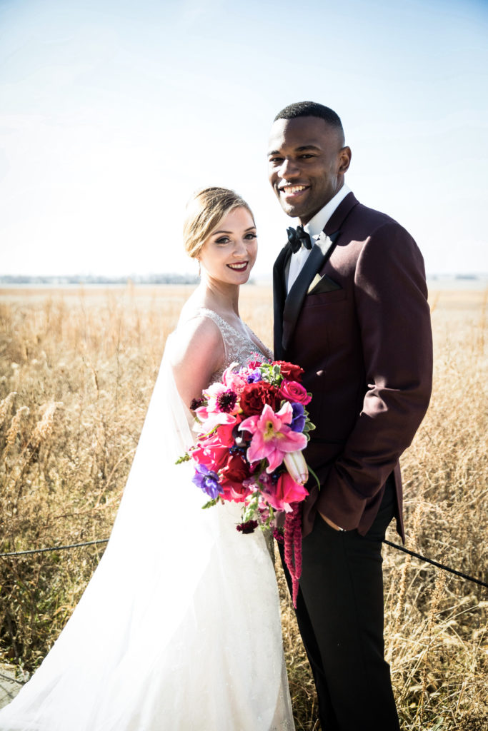
For the Color Crush wedding design here is what I selected:
- Black
- Grey
- Magenta, Red, Cobalt Blue
- Ceremony Arch, Bridal Bouquet and Wedding Cake
Now, you can add a Crush of Color!
Creative Professional Vendor Team: Cut it. The Cake Artist’s Studio | Glow it. Something You Salon & Spa | Dress it. Michelle’s Bridal & Tuxedo | Smell it. A. Hunt Designs | Eat it. Michaels’ Catering | Suit it. Michelle’s Bridal & Tuxedo | Snap it. Rachael Schirano Photography | Rent it. BBJ Linen, Halls’s Rentals, Merle Allyce | Write it. A.P. Calligraphy | Select it. Bluestem Hall