


Apr
29
2022 Wedding Colors
Comments Off on 2022 Wedding Colors
Top 3 Wedding Colors Couples are Loving!
Today, we are inspired by the “Bridgerton” series of romantic pastels, the bold colors from “NY Fashion Week” and the Midwest couple’s color pick of “Pink.” I love being inspired by the culture of our times when creating a wedding design look. It is a great start to laying the foundation of the overall couple’s style and I hope these color palettes help lead you to creating dream wedding day look!
|1| Bridgeton Pastels

A perfect mix of the Regency era and modern-day with a soft color palette of blush, baby blue, lemon and ivory. The style of the times was empire-waist dresses, statement sleeves, house dresses and breezy dresses with romantic prints. For creating your wedding design look I recommend you do: a floral table linen and soften it with a blush, blue or yellow napkin. Then add soft metals like rose gold and gold in your flatware, taper candles or votives.


Since, this was an era that was about extravagance and wealth, I love the idea of doing glassware with a gold rim. As you create your dining tables, image yourself transformed back to that time, dining at an elegant oversized table.
|2| Bold Fashion
A pop of color is on trend this year at NY Fashion week! You will find bold & soft colors perfectly blended together for the everyday individual with a color palette of turquoise, yellow, orange, blush pink and light yellow. The fashion styles going down the runway are dramatic with cutouts, oversized jackets, puff sleeves and linear patterns.
 For creating your wedding design look I recommend you do: a solid linen with a simple texture with the same napkin so you can highlight the middle of the table with bold florals. Then add in a pattern runner to draw together the floral arrangement and balance it with a matte flatware, simple votives and a bold geometric stationery card.

Since, NY is a city that is vibrant in culture you can go outside the box in your creativity for the tabletop. I was inspired by the eclectic boutique hotels you find in the city, whether influenced culturally or by the speakeasy vibe an over-the-top table look will leave your guests saying, “wow”!
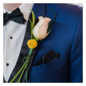
|3| Pretty ‘N Pink
I think any year we can be “Pretty ‘N Pink” we should! Whether you prefer the lighter or darker tones of pink, couple’s love the wide spectrum to choose from. Also, I think couple’s are drawn to this color as its meaning of sweetness, romance, charm and tenderness is something we all need this year. The shades of pinks I like to consider for a wedding look are: baby pink, carnation, french pink, hot pink, fiery rose, garnet pink, burgundy and red. For creating your wedding design look I recommend you the primary color to be dark or light then add in the contrast to that, so you have a lush & vibrant mix of colors. When selecting your bridesmaid attire and grooms attire, stick with the same tone so there is a cohesiveness throughout. Then, do a colored pink plate or glass to compliment your wedding attire. For this particular design look, I drew my inspiration in from the charm and warmth you find when visiting a cathedral! From the stain glass mirrors, paintings and tapestry you have a since of connection and love around you, just like on your wedding day!


If you need a wedding designer to hire to create your wedding look, you can hire us with the Design Guide service. We can also be there for your wedding day as a day-of coordinator to ensure the execution of the day is stress-free & seamless for you!
Photo Credit (Bridgeton Pastels): kDarling Photography | (NY Fashion) Lisa Shreffler Photography | (Color “Pink”) kDarling Photography